Case Study · Product Design · Mobile App
CrossFit Journal App Localization
Designing multi-language localization and filtering for the CrossFit Journal iOS and Android apps — bringing global content closer to a worldwide audience without breaking an inherited design system.
The CrossFit Journal app, designed to deliver articles and video content to a global audience.
Overview
The CrossFit Journal was a core publication for the CrossFit brand, featuring articles and videos on health, programming, and success stories. While much of the content was free, premium tiers unlocked deeper access to long-form content and video.
With over 15,000 global affiliates, CrossFit HQ was shifting toward better support for a worldwide audience. Journal content was produced primarily in English, leaving many users reliant on third-party tools to translate content. The goal: make it possible for users to easily discover content in their preferred language directly within the native apps.
Role & Impact
Product Designer
Led UX and UI exploration for localization and filtering inside an inherited app — from flows and personas to high-fidelity prototypes and developer-ready specifications.
Product Context
Global Content, Local Needs
Designed a way for users to choose preferred languages and topics — for example, “nutrition articles in Italian” — and see relevant results without leaving the app.
Constraints
Inherited System
Project Goal & My Role
With a rapidly growing global audience, CrossFit HQ needed the Journal to feel accessible beyond English-speaking users. The goal was to:
- Let users easily select the language they wanted to read and watch content in
- Combine language preferences with topic filters (e.g., “nutrition” or “business”)
- Keep everything aligned with the existing CrossFit Journal app look and feel
My role was to:
- Identify flows and design solutions for language and content filtering
- Uncover potential user pain points and failure modes
- Present solutions and prototypes to stakeholders and project teams
- Deliver specs and assets to engineering for implementation
Research & Exploration
The existing Journal app predated the internal application team and was designed and built by an outside firm. That meant we needed to:
- Understand the current app architecture and behavior
- Work within established visual patterns and interaction conventions
- Layer on new functionality without introducing jarring changes
We created sample personas to anchor our flows — from U.S.-based, English-speaking parents searching for nutrition advice to affiliate owners in Venice, Italy looking for programming tips. The goal was to surface patterns in how they’d search, filter, and recover when content wasn’t available.
Collaboration was critical: in an agile release environment, we regularly shared whiteboard explorations and early flows with the team, highlighting risks and tradeoffs before committing to a direction.
Prototyping & Navigation Design
Once flows were aligned, I moved into prototyping. Although low-fidelity frames existed from earlier work, a key challenge emerged: we didn’t have the original design files for the current app. To move forward, I recreated core UI elements — screens, buttons, navigation bars, and icons — from scratch.
This added effort up front but paid off by giving us a solid internal design system for future work.
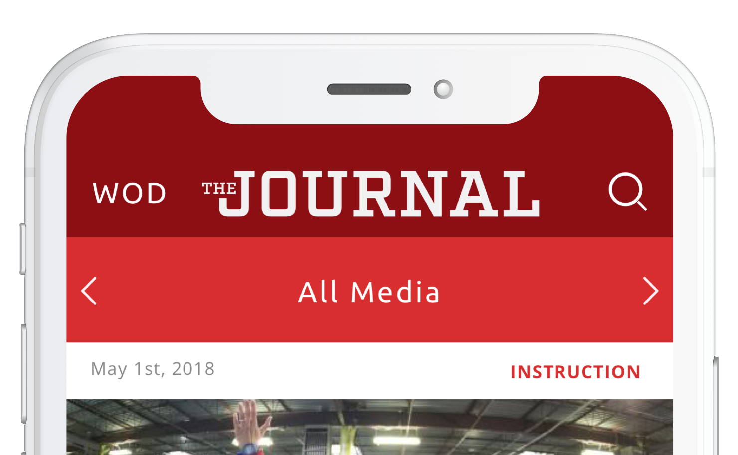
Previous navigation bar layout, with logo, section label, and a magnifying glass icon for search.
The original navigation bar displayed:
- The app logo (“Journal”)
- The current section
- A magnifying glass icon to access search
New localization features risked overcrowding the nav bar and adding yet another layer of complexity to an already constrained layout. The existing search implementation also required an extra screen, which we wanted to eliminate.
We moved forward with these changes:
- Removed the app logo from the top to free up space
- Preserved the ability to switch between “Media” and “WOD”
- Replaced the magnifying glass icon with an inline search field
- Introduced a new filter control for content and language
- Defined active/inactive states for filter icons
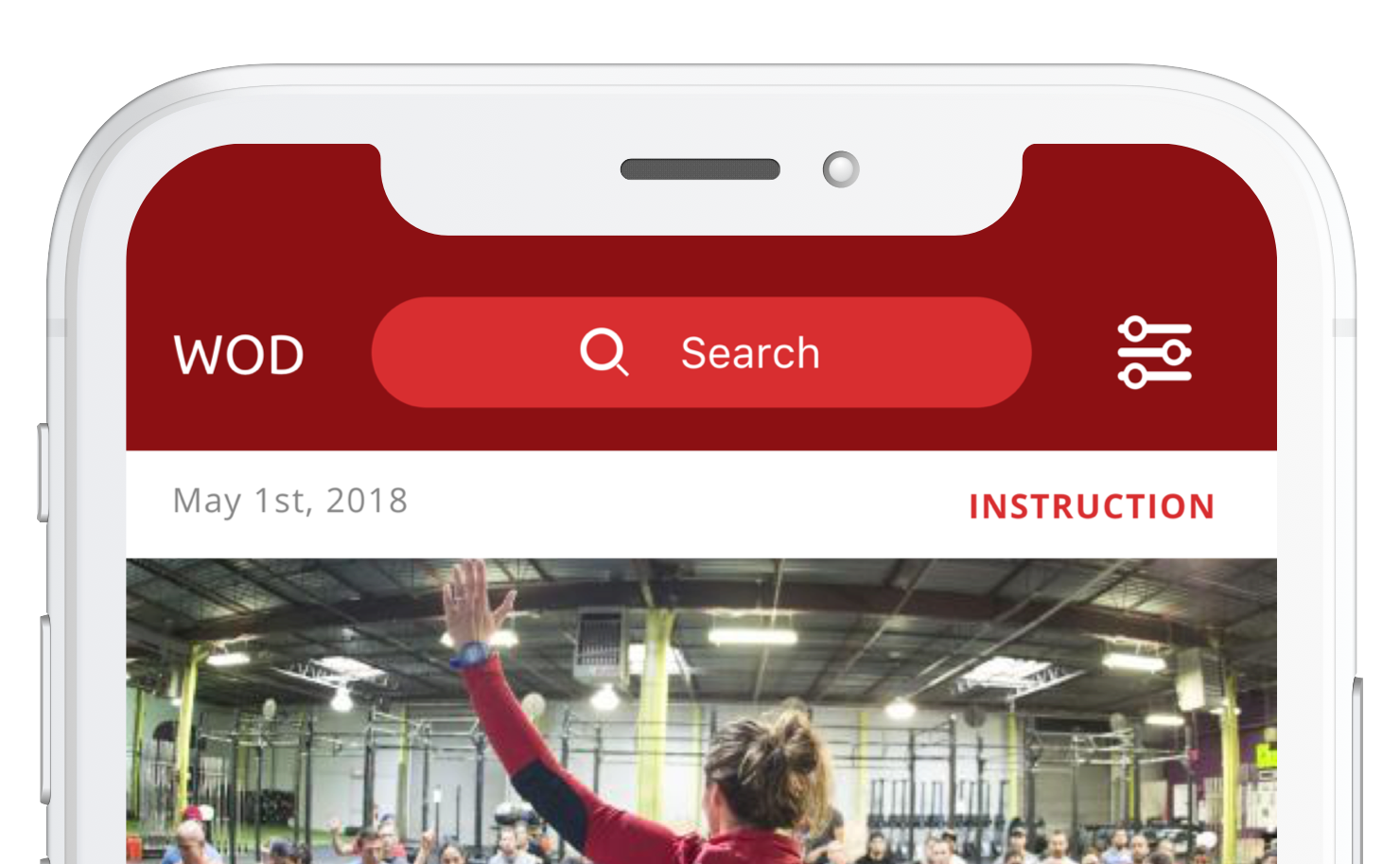
Updated navigation bar incorporating inline search and new filtering options.
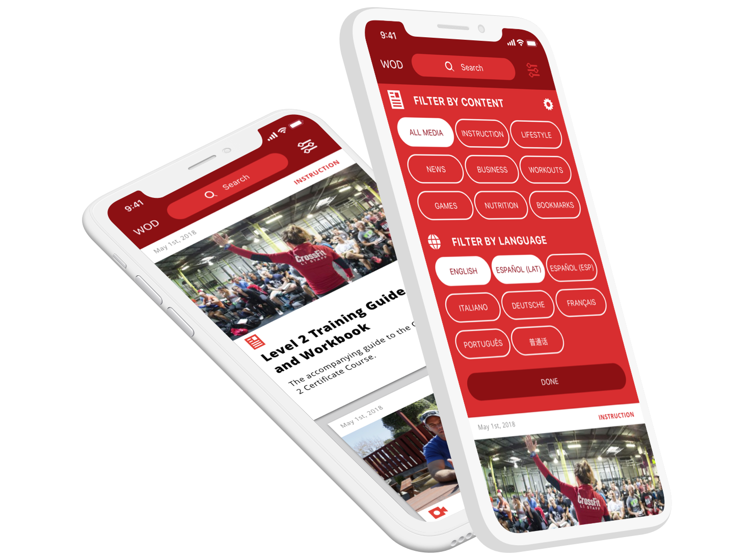
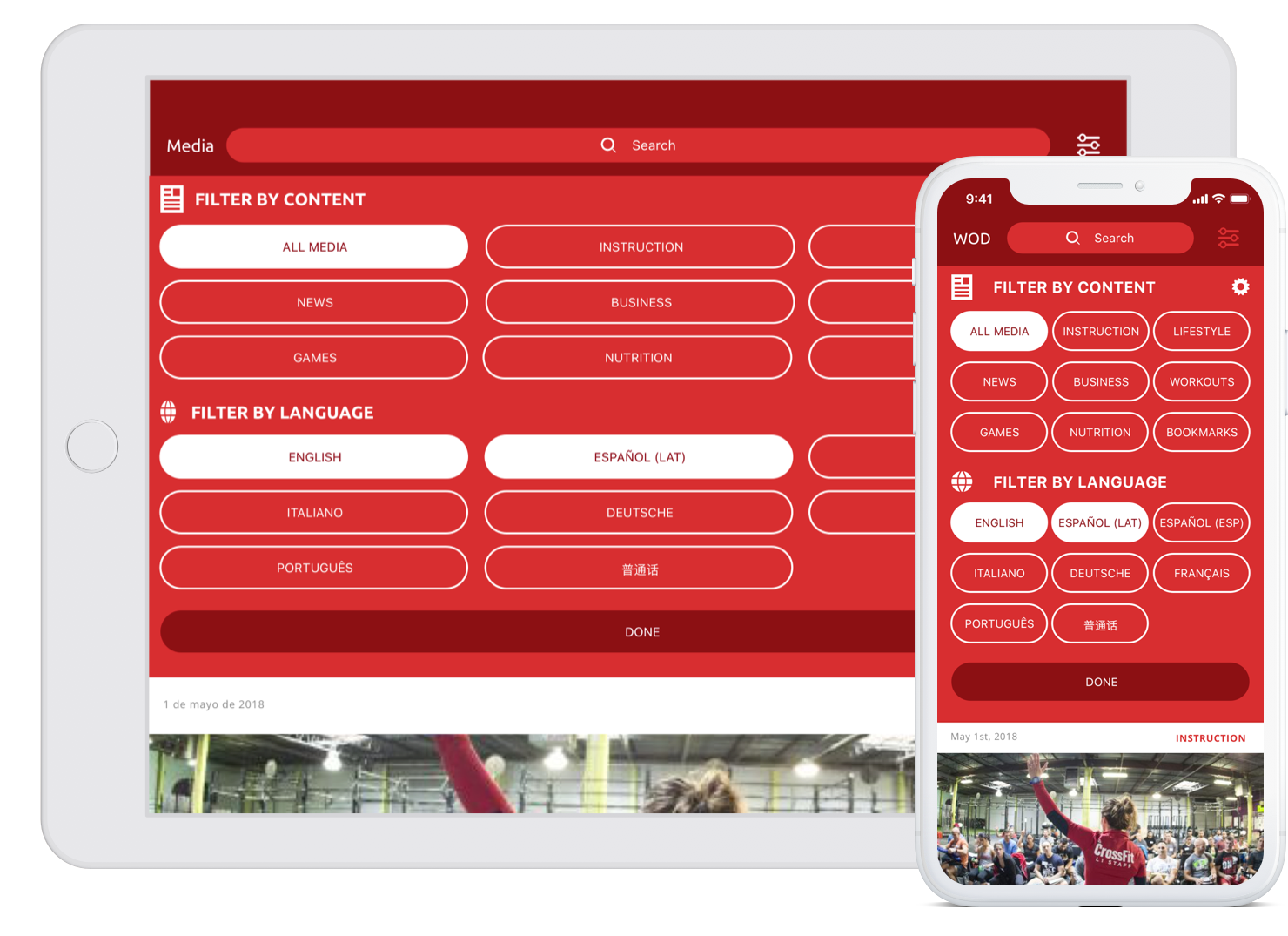
Filtering, Performance & Language Decisions
A key concern from engineering was how the system would handle filtering. An early concept had the app respond in real-time to each filter toggle — but at scale, live-updating results on every interaction risked overloading the backend.
The solution was to introduce an explicit action button at the bottom of the filter sheet: users could select content types and languages, then tap a “done” or “apply” action to update the feed. For example: Instruction and Business, in English and Spanish.

Updated design showing content and language filtering with an explicit apply action.
Another design question: how should languages be displayed — translated into the user’s language or shown in their native spelling?
Since the app read the user’s system language and localized core UI by default, we ultimately chose to display language options in their native spelling (e.g., “Español”, “Italiano”), preserving clarity and respecting how speakers identify their own language.
The updated CrossFit Journal app layout, incorporating localization and content filtering.
Outcome
The localization and filtering updates were fully designed, implemented, and tested by QA and select users during pre-rollout. However, before a full public launch, the initiative was superseded by a larger project: the redesign of crossfit.com.
The new “mainsite” merged Journal content into a broader experience and ultimately dissolved the standalone Journal app. While the app remains available, it is no longer actively updated or treated as a primary channel. Journal-style content now lives within the redesigned crossfit.com experience.
Even without a long production life, this project:
- Established internal app assets and patterns where none existed
- Tested a scalable approach to localization and filtering
- Informed future decisions about content discovery on crossfit.com
Conclusion
The CrossFit Journal localization effort shows how product design can create leverage even when a project is ultimately folded into something larger. By deeply understanding user needs, technical constraints, and an inherited design system, we defined a clear pattern for multi-language content discovery that informed future work.
My contributions spanned research, flow design, UI exploration, asset creation, and close collaboration with engineering and QA. The result was a thoughtful, scalable approach to localization that helped shape how CrossFit thinks about global content delivery across platforms.