Case Study · DATA VISUALIZATION · CrossFit Games
CrossFit Games 2019 Leaderboard
Large-Scale Data Visualization & Real-Time Analytics Platform. Designed a data visualization system serving 300,000+ athletes across multiple competition divisions, with real-time leaderboard updates, complex filtering interfaces, and multi-platform data presentation for web, mobile, and live broadcast.
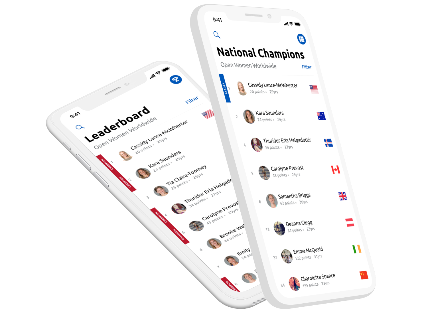
The CrossFit Games leaderboard experience across desktop, mobile browser, and the official Games app.
Overview
The CrossFit Games online leaderboard is a large-scale data platform processing workout scores from 300,000+ athletes across 150+ countries, serving as the single source of truth for athlete rankings, qualification status, and competition standings.
As the primary designer for the 2019 leaderboard update, I led the data visualization strategy that balanced complex filtering requirements (divisions, countries, regions), real-time score updates, and multi-platform presentation—from mobile apps to live broadcast overlays.
The Data Challenge:
- 300,000+ athletes submitting scores across multiple workout rounds
- Real-time ranking calculations across 15+ divisions (Individuals, Teams, Age Groups)
- Country and regional breakdowns for National Champions feature
- Performance across web, iOS, Android, and broadcast integrations
- Scalability during peak submission periods (100,000+ concurrent users)
Role & Impact
Product Designer
Partnered with stakeholders to interpret new 2019 competition requirements and design leaderboard updates across desktop, mobile web, and the official CrossFit Games apps.
Product Context
Live Competition UI
Design changes had to respect entrenched mental models, support heavy traffic during the Open, and work within an established visual and technical system.
Scale & Usage
Global Reach
Problem & Opportunity
The CrossFit online leaderboard has evolved each season since its initial release in 2011. For the 2019 Open, stakeholders needed to introduce new functionality without disrupting the core experience athletes relied on.
There were three primary asks:
- Showcase each athlete’s country directly in the leaderboard view
- Allow users to view both the overall leaderboard and national champions
- Remove outdated filters that no longer applied to the 2019 format
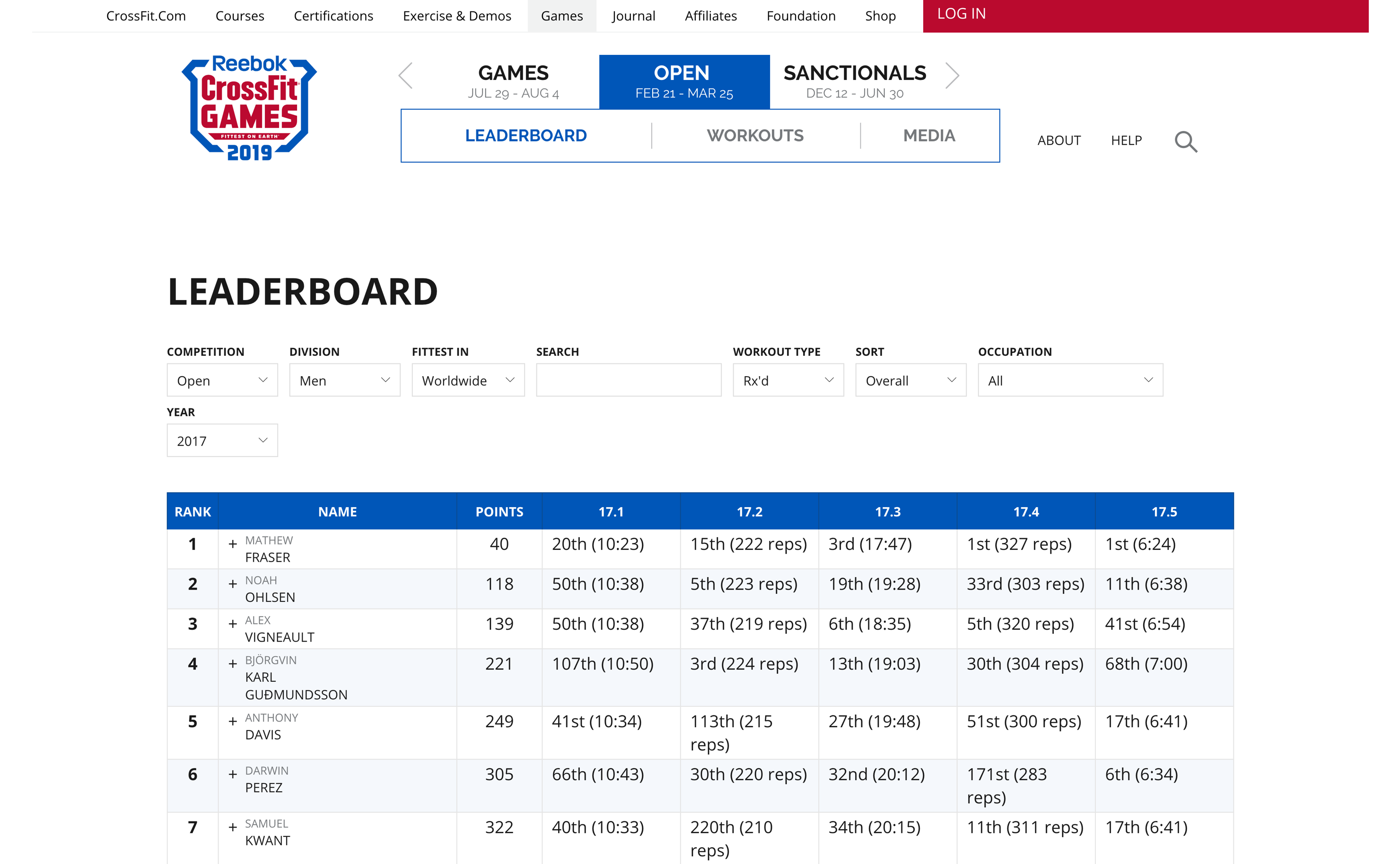
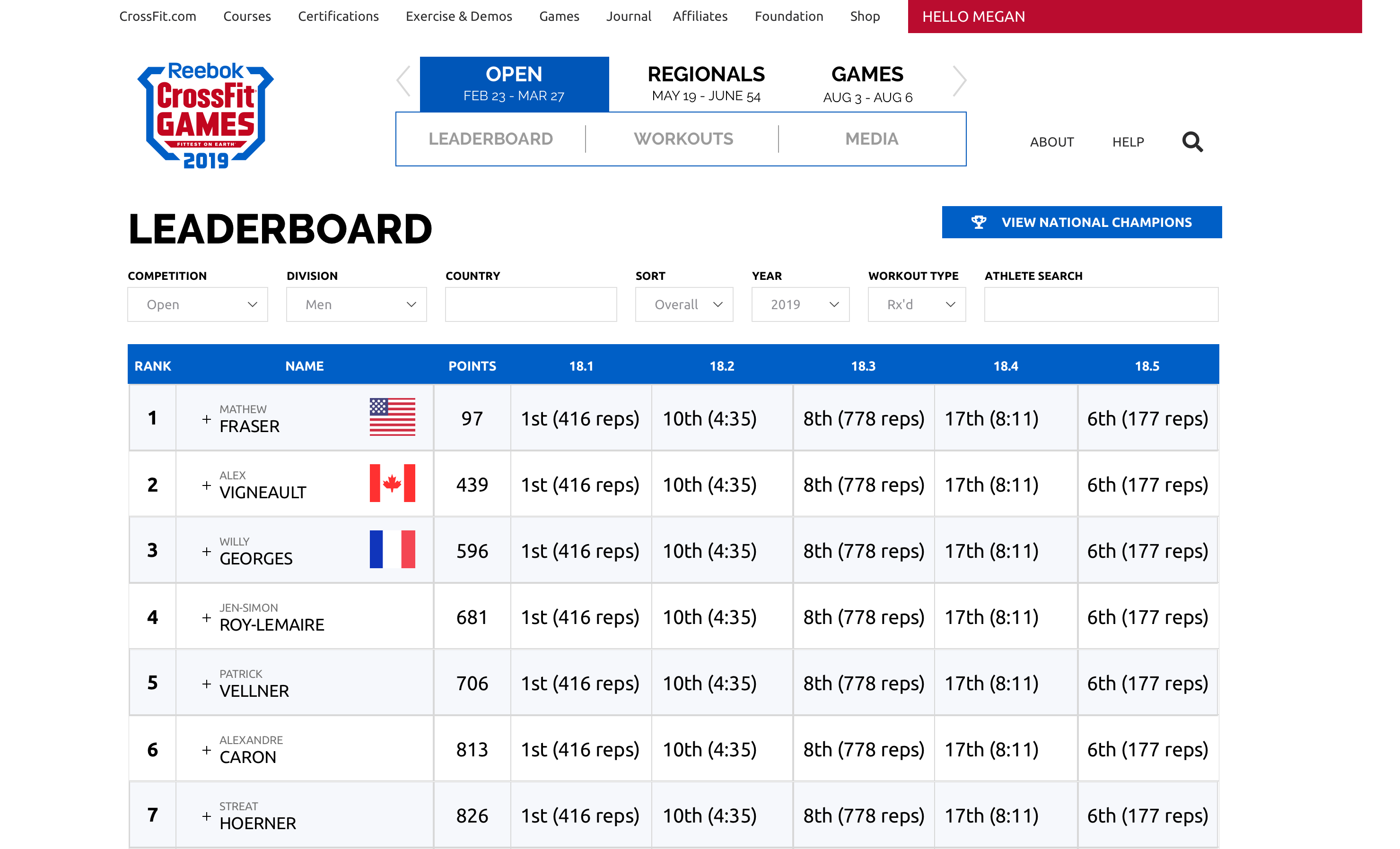
CrossFit Open Leaderboard (2017). The 2019 update needed to layer in new requirements without breaking a familiar layout.
The opportunity: evolve the leaderboard to reflect a more global, country-driven competition structure, while keeping the interface intuitive for returning athletes and spectators.
My Role: Translating Competition Rules into UI
I was responsible for interpreting new 2019 competition rules, exploring layout options across desktop and mobile, and collaborating with developers to ship the experience in time for the Open.
Discovery
Definition
Design
Build
Launch
Strategic Ownership
- Translated new competition format into concrete UI requirements
- Balanced stakeholder asks with usability and visual constraints
Execution
- Designed table layouts and flag treatments for collapsed and expanded rows
- Created toggle patterns for overall vs. national leaderboards
Collaboration
- Worked closely with developers through build and QA to ensure fidelity
- Adjusted interactions late in the cycle when requirements changed
Design Process: Bringing Countries into View
Early Exploration: Where Do Flags Belong?
Adding a country flag to each athlete’s row had been discussed in previous seasons but never fully implemented. In 2018, several concepts explored showing the flag next to the athlete’s picture — however, this required expanding each row to see both the photo and the flag.
Early exploration: pairing the athlete photo with their country flag in the expanded row state.
For 2019, flags were more than decoration — they became a core interaction: clicking a flag should show that country’s leaders. That meant the flag needed to be visible in the collapsed row without requiring an extra tap or click.
Spacing & Readability Constraints
The leaderboard is a dense, table-based layout: each row shows rank, athlete name, and scores for each workout. Long last names, especially for Games athletes, already pushed the layout to its limits. Any additional element risked wrapping names onto three lines or compressing core data.
I explored several approaches, including slimmer vertical flags placed to the left of the athlete’s name. This conserved horizontal space but made some flags harder to recognize at a glance.
Vertical flag explorations helped with spacing but sacrificed quick recognizability.
Final Placement: Standard Flags, Familiar Location
Ultimately, we chose a rectangular flag to the right of the athlete’s name — a familiar representation that matched users’ mental model of country flags. This area was previously used for “invite status” in 2018; with regionals removed, that space became available for the new flag treatment.
Final decision: standard rectangular flags to the right of the athlete’s name, aligned with existing table patterns.
While oval flag treatments used less space, we chose rectangles to align with global conventions and keep recognition instant, especially during live competition.
Interaction Design: National vs. Overall Leaders
With flags in place, the next challenge was helping users move between the overall leaderboard and the new national champion perspective. We introduced a clear toggle to swap between “Open” (overall) and “National” views, supported by iconography that also worked well on mobile.
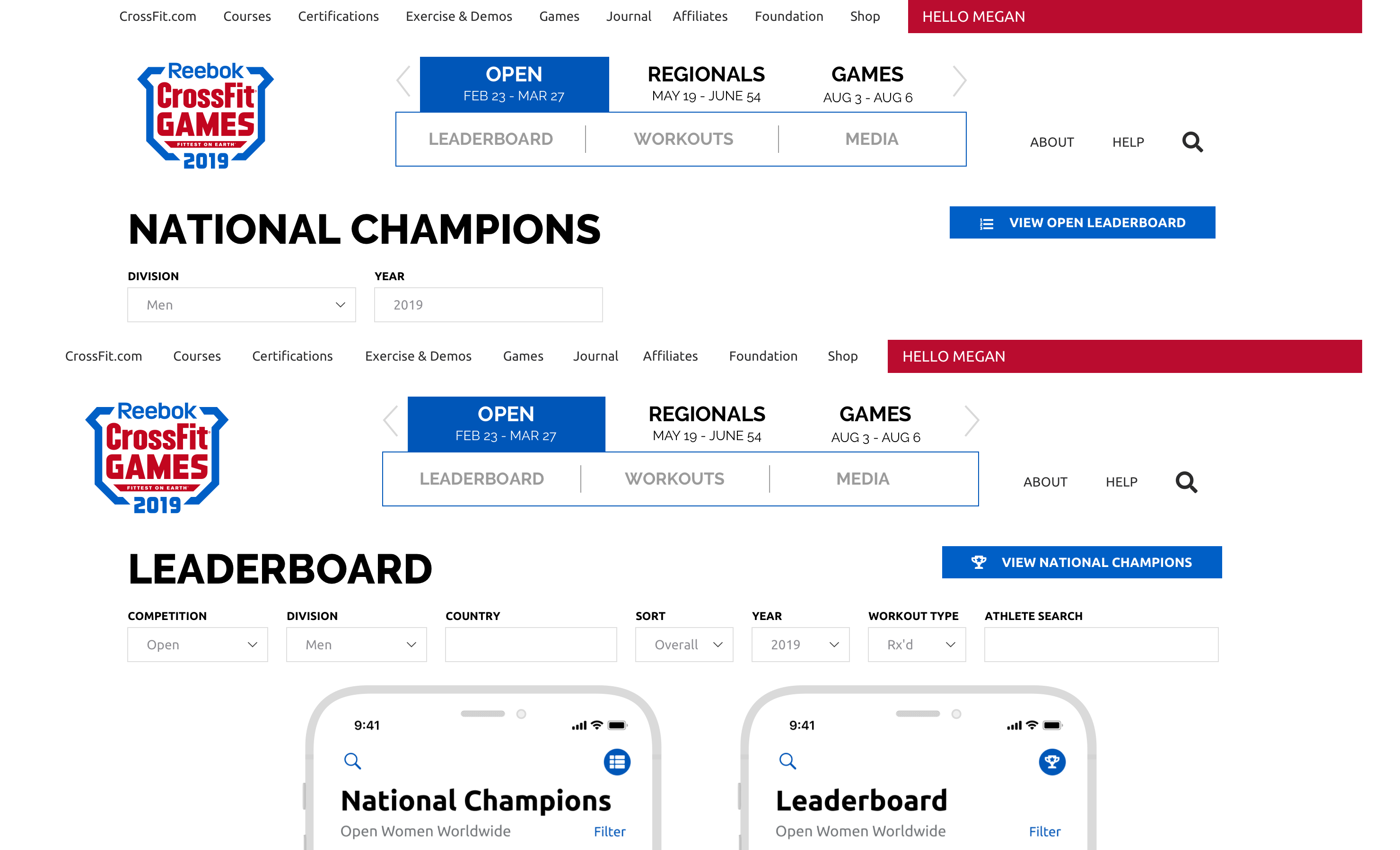
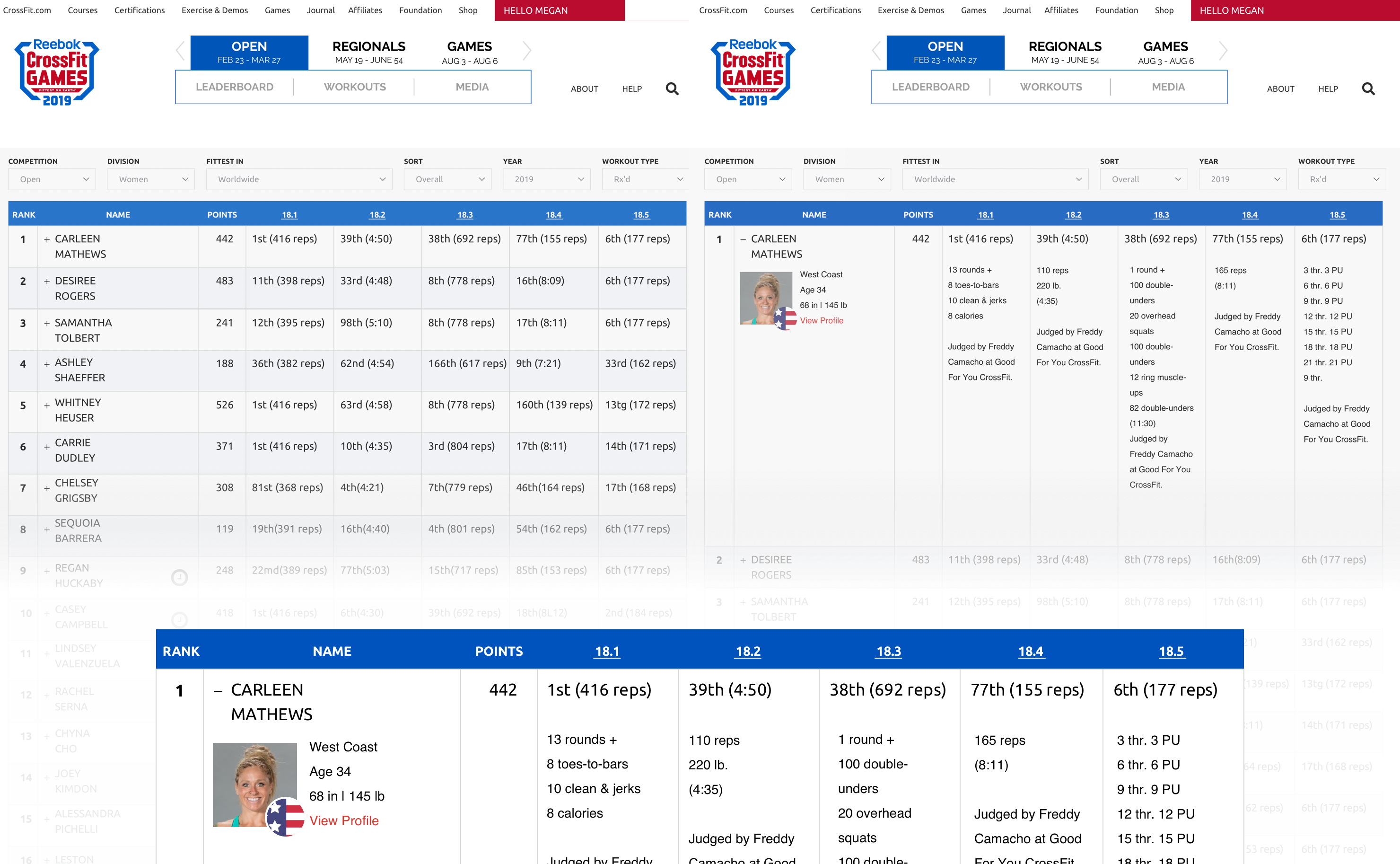
Open and National leaderboard toggle states for desktop and mobile.
During development, requirements evolved: instead of flags only for country leaders, every athlete would display a flag, and clicking any flag would filter the leaderboard to that country. This change increased the value of the flag and validated the decision to surface it in the collapsed row.
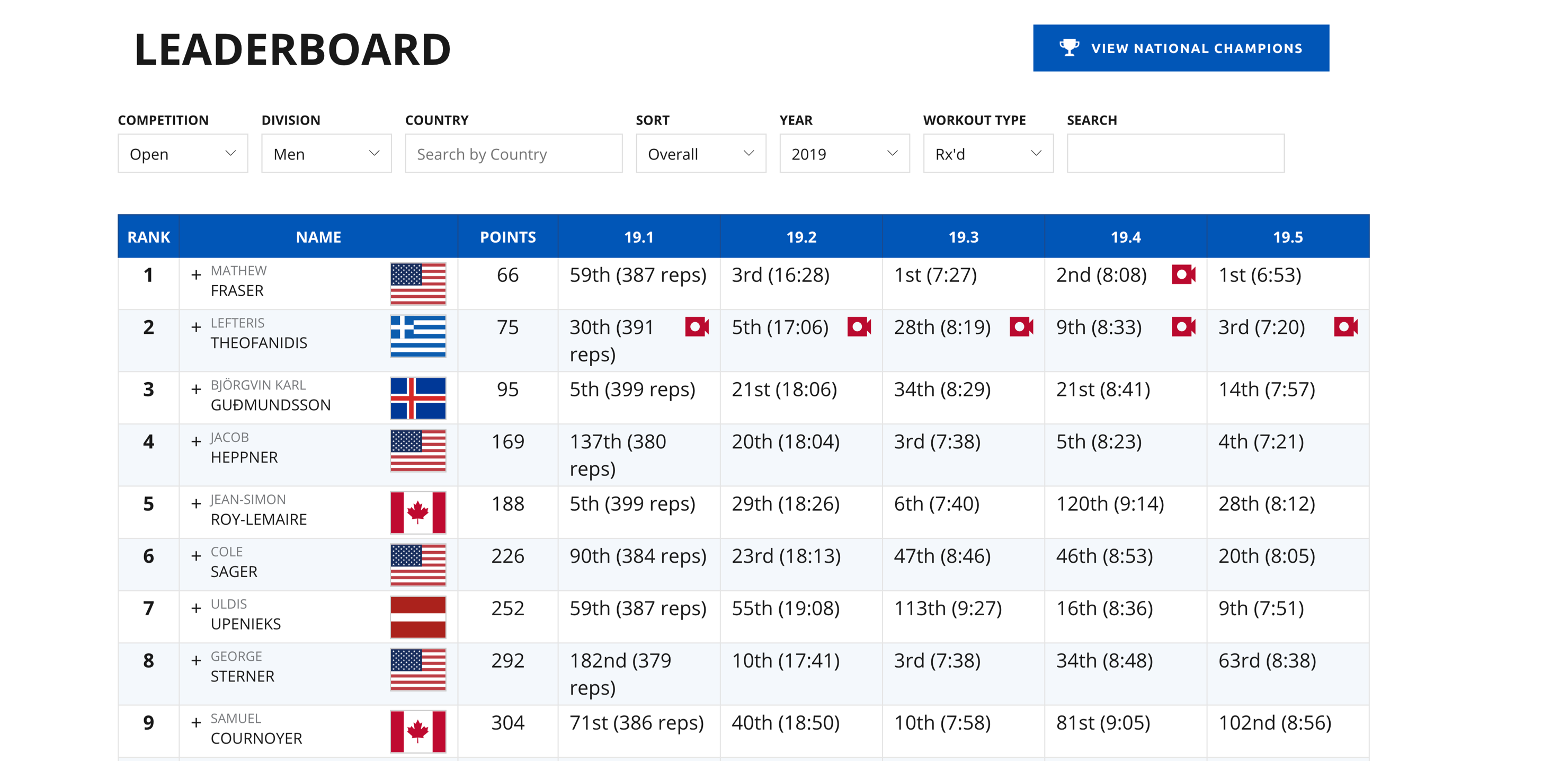
Final behavior: every athlete row includes a flag; selecting a flag filters the leaderboard to that country.
Outcome & Impact
Outcome
On-Time Launch for a Global Audience
The updated leaderboard shipped in January 2019, just in time for the new CrossFit Open season. It was used by close to 500,000 participants across desktop, mobile browsers, and the official CrossFit Games iOS and Android applications.
Athletes could now:
- See their country at a glance in the main leaderboard view
- Toggle between overall and national leaderboards
- Filter the board by clicking any country flag
The leaderboard remains available at games.crossfit.com and within the official CrossFit Games app.
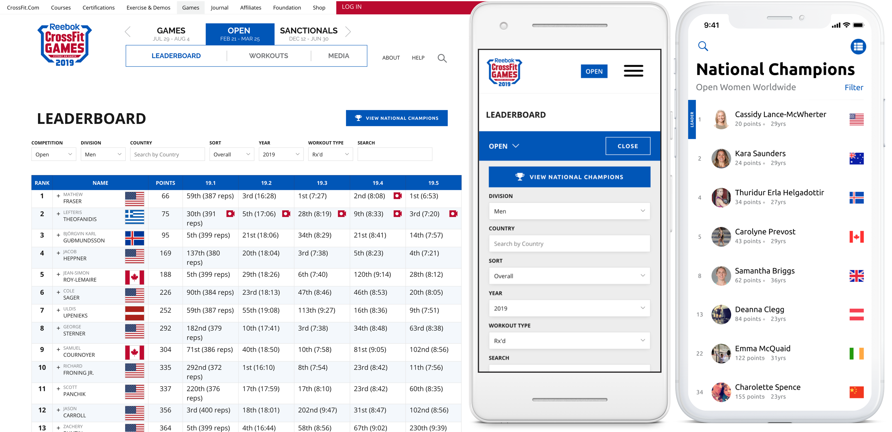
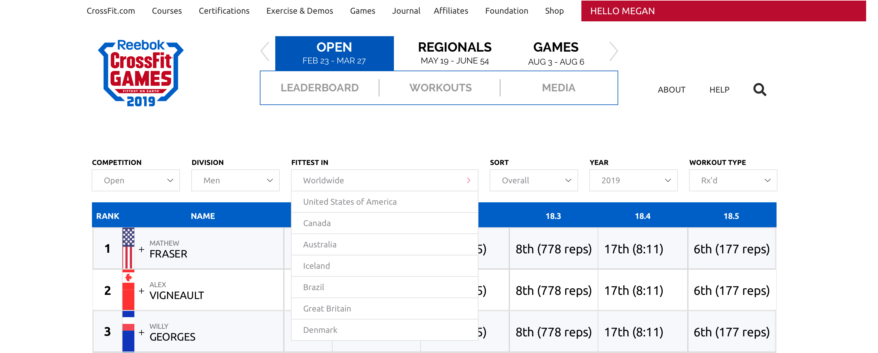
Final 2019 CrossFit Open leaderboard, shipped across desktop, mobile web, and the official Games apps.
Conclusion
This project demonstrates how seemingly “small” UI changes can carry outsized impact in a live, global competition environment. By carefully balancing new requirements with existing patterns, we delivered a leaderboard that felt familiar to returning athletes while supporting a more global, country-focused format.
My role spanned from interpreting rule changes and designing table interactions to partnering with development through implementation and QA. The result was a leaderboard update that scaled cleanly across surfaces and supported hundreds of thousands of athletes through the 2019 Open.